HR Booklet
Design Brief - Create a booklet to illustrate the core values and goals of a company.
Design Brief - Create a booklet to illustrate the core values and goals of a company.
My primary contact for this project was the company CEO, who had a lot of strong opinions about the style of the book and its contents. I conducted several interviews to get a sense of the company spirit. I brought in sketches and drafts from an early stage to try to get a reaction, and see if that could help us iron out a clear brief and any requirements or things to avoid.
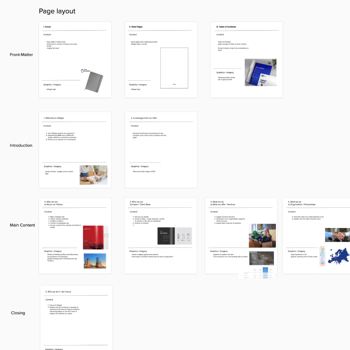
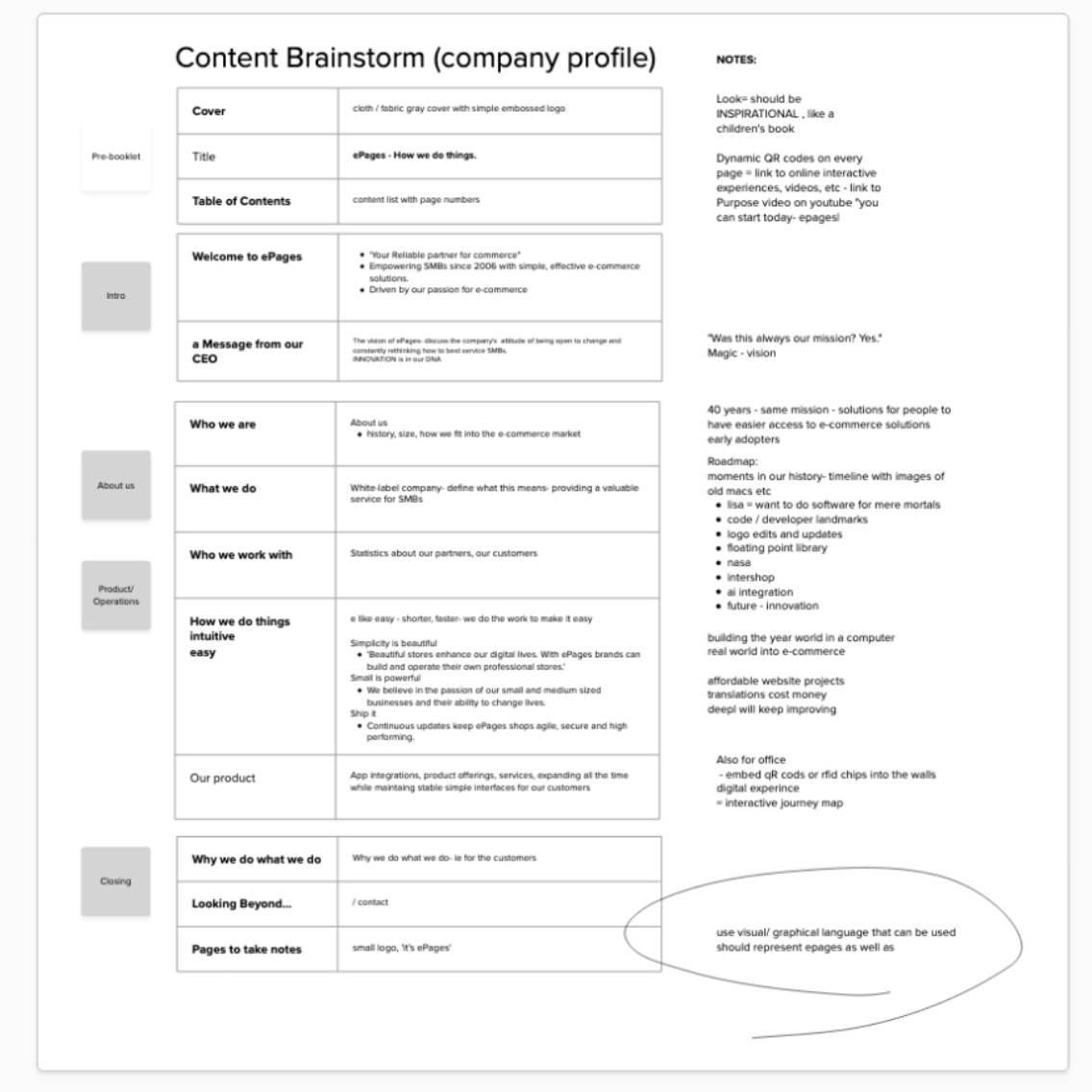
Content to include in the booklet, as outlined by me and the marketing team.
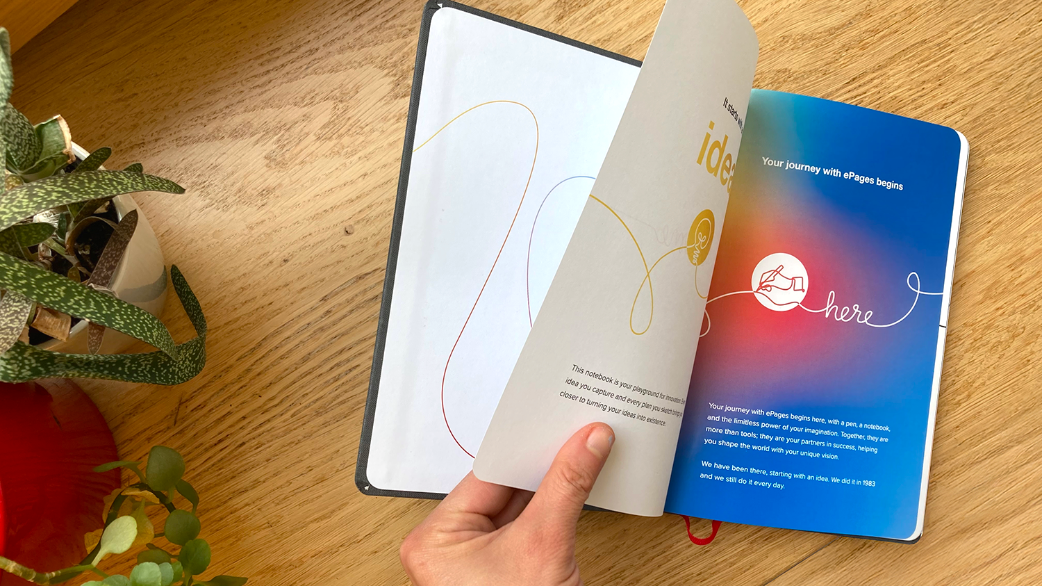
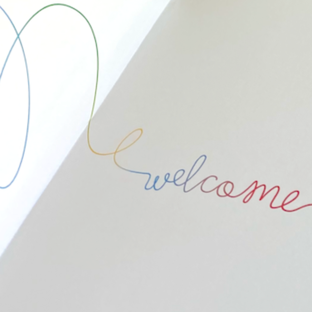
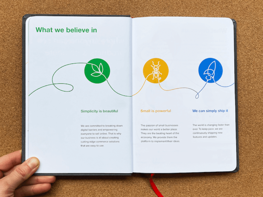
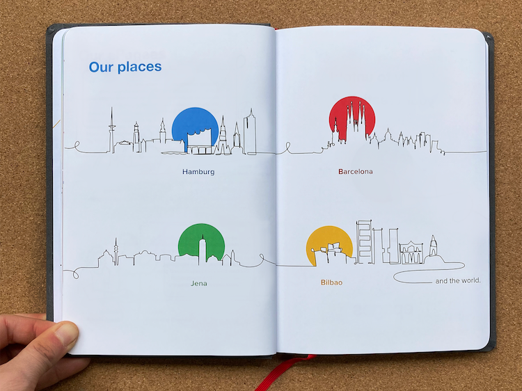
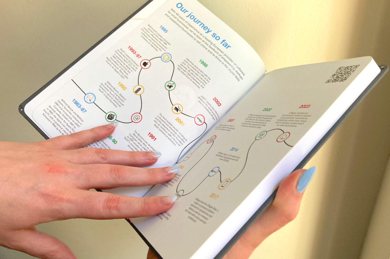
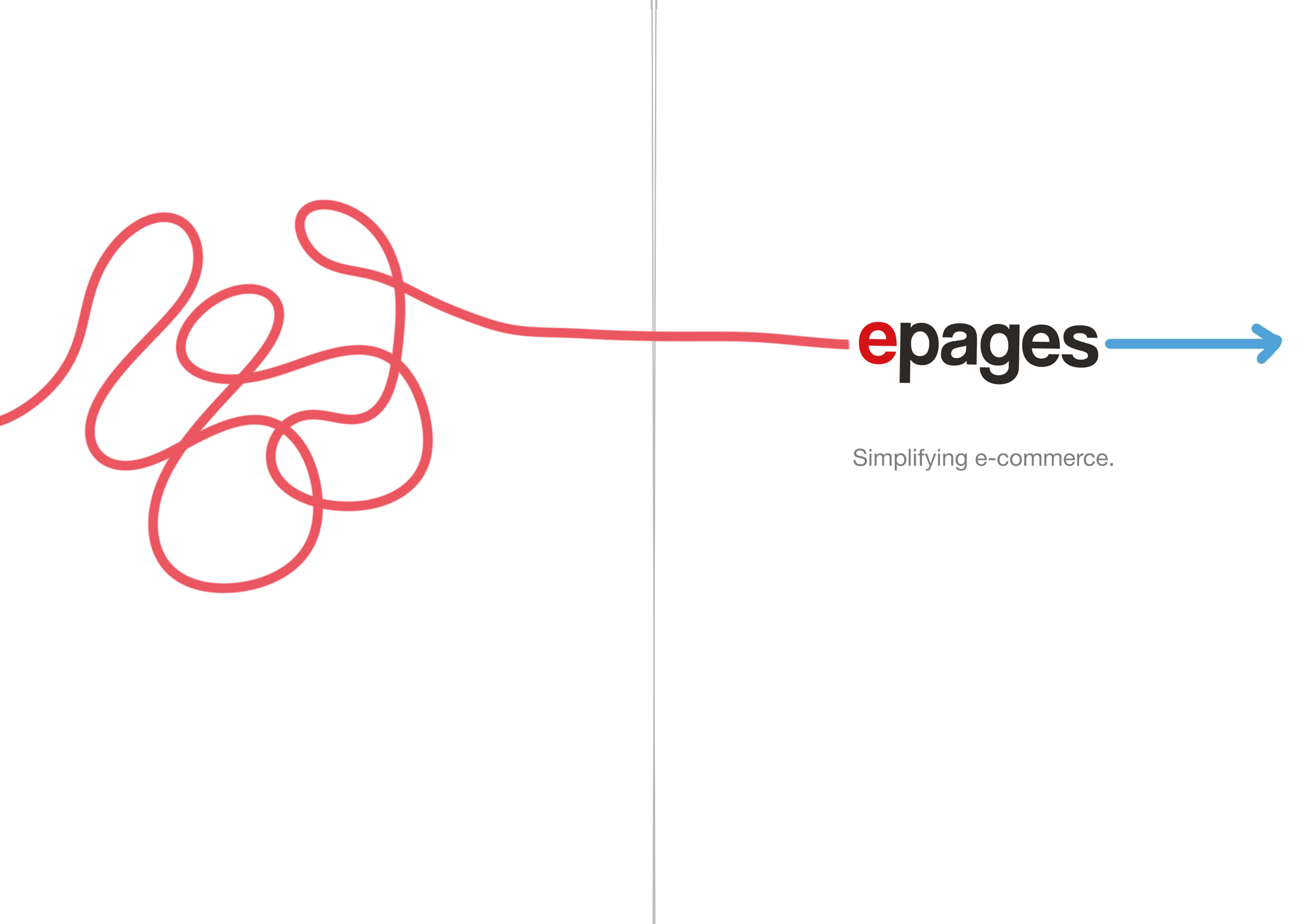
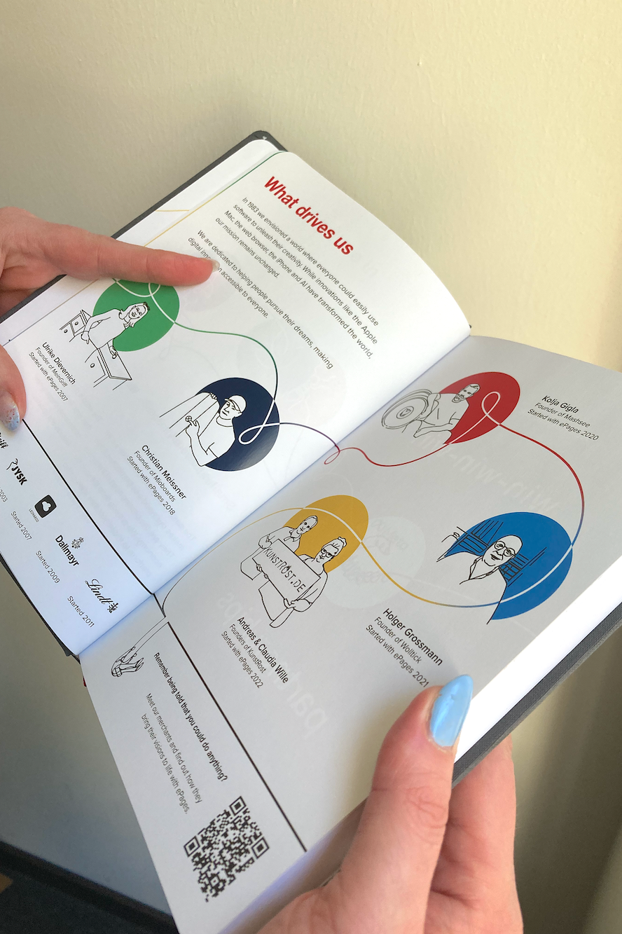
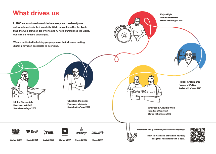
Inspired by the conversations we had around a timeline of the company history, and the overall business goal of "simplifying e-commerce", I decided that a single continuous line could be a powerful (and flexible) motif to tie the book's content together. A line can be whimsical, expressive, and minimalistic. It could also fit with the bright colors of the company's branding booklet.
I wanted the line to lead the reader through the story, tying everything and everyone in the company together while pointing continuously towards the future. I found it quite optimistic.
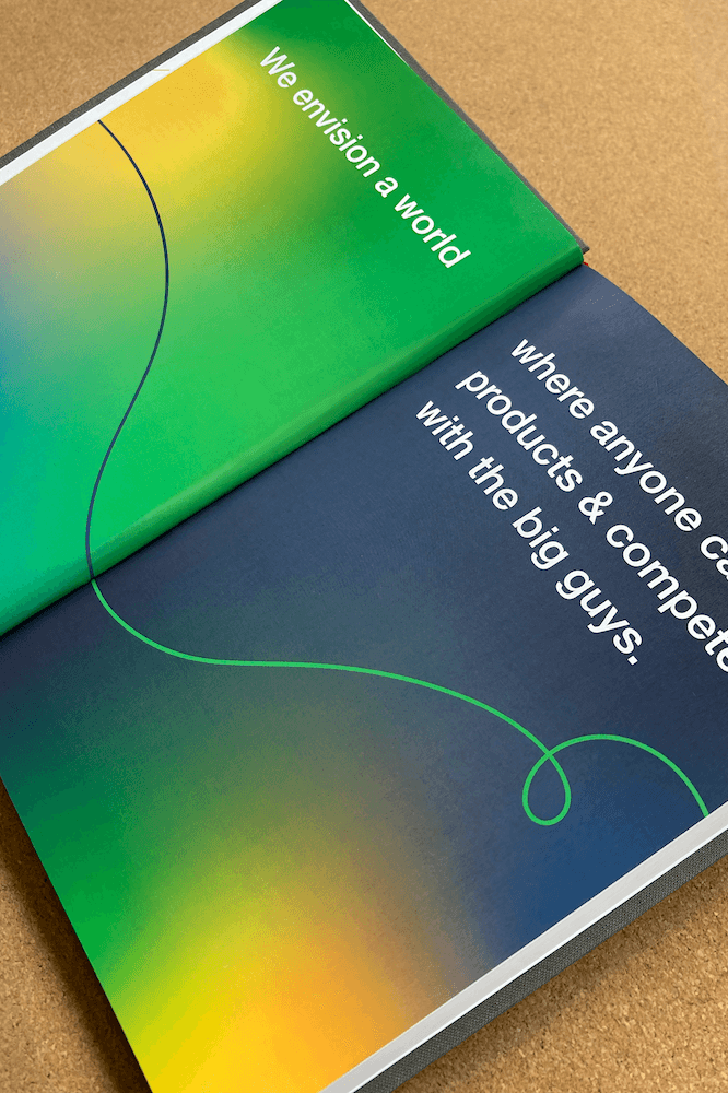
Unfortunately this concept was quite difficult to get to print perfectly, due to the line not aligning from page to page, but we got pretty close.
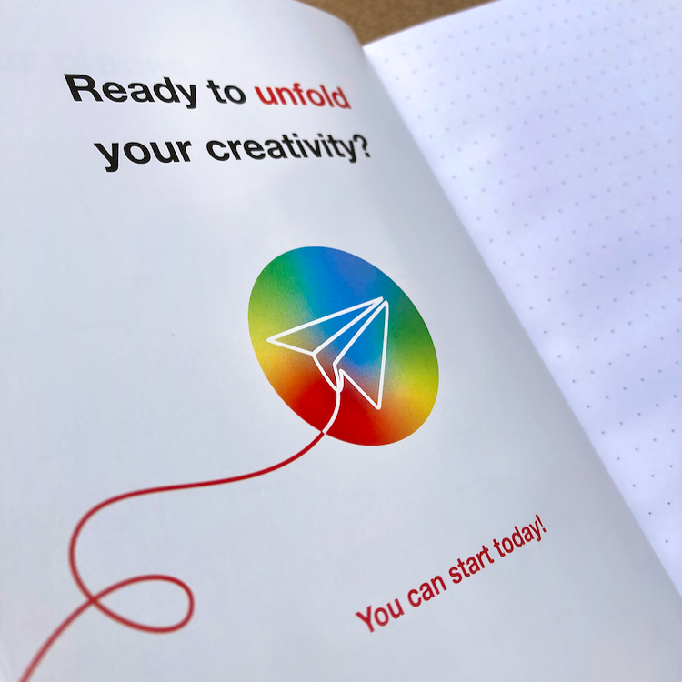
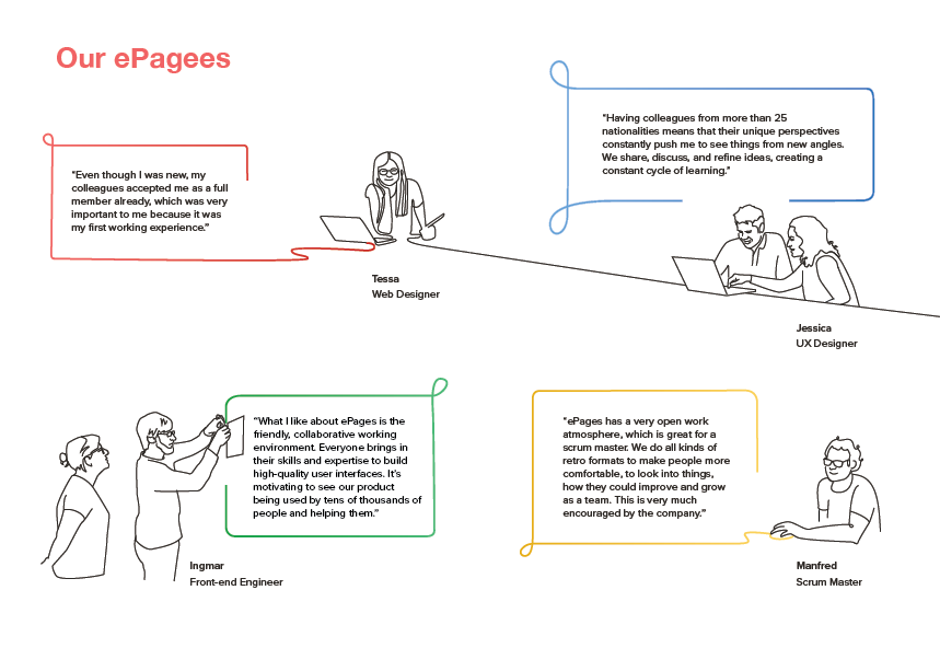
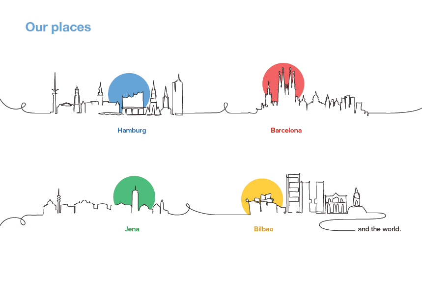
Tying in with the line motif, I wanted to use a series of loopy, hand drawn icons to illustrate the different pages. This was a bit of a challenge, since some page concepts were difficult to boil down to a single icon (how do you represent a "White-Label Company with an icon?) but we made it work in general. I found that the lines and icons paired nicely with these circles of negative space.
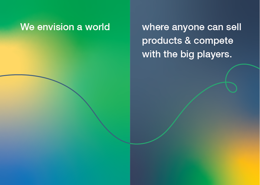
I eventually brought additional gradients into the booklet to try to update the branding and make the book feel more relevant, but I also think that the simplicity works quite well on it's own. You can see a little of the progression between drafts below.
To share the booklet more easily with prospective employees and partners not in the country we made a digital version. Take a look here.
