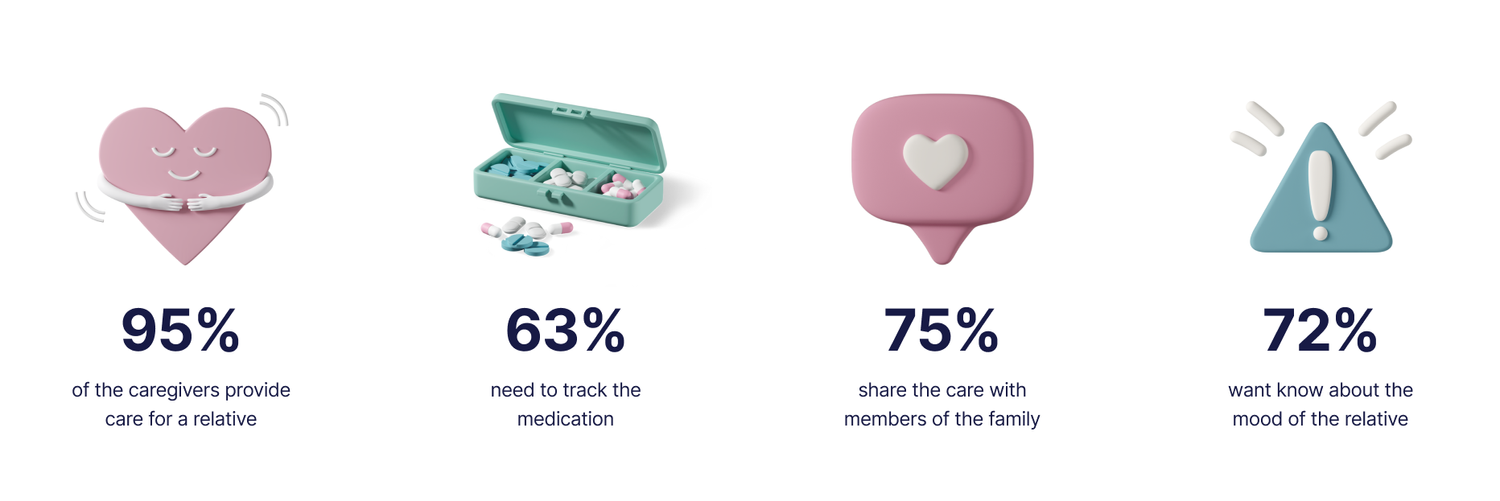
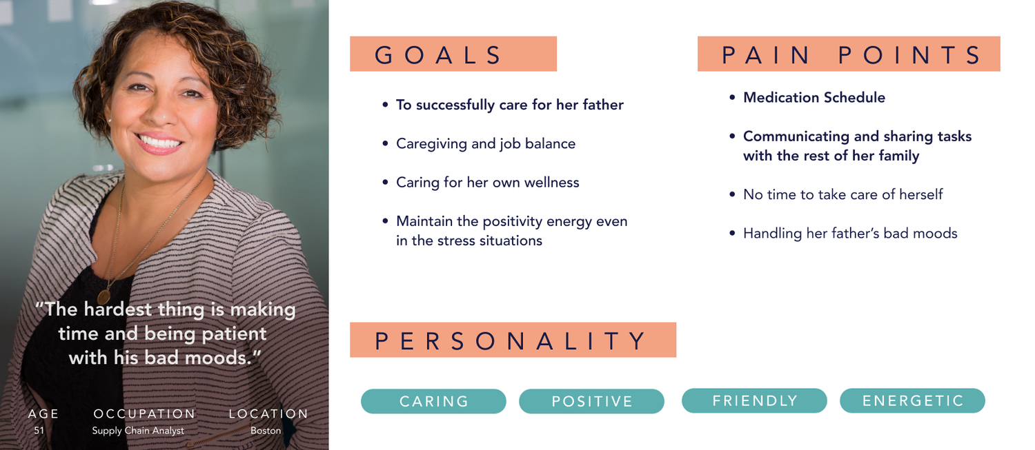
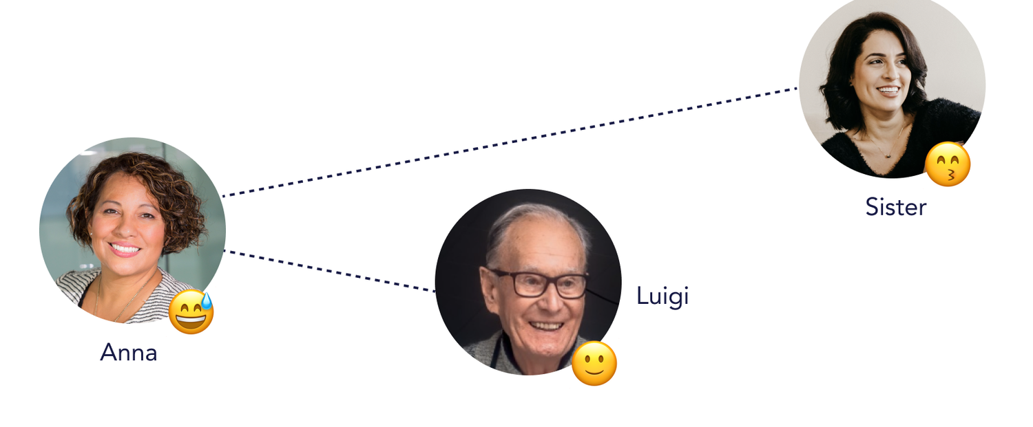
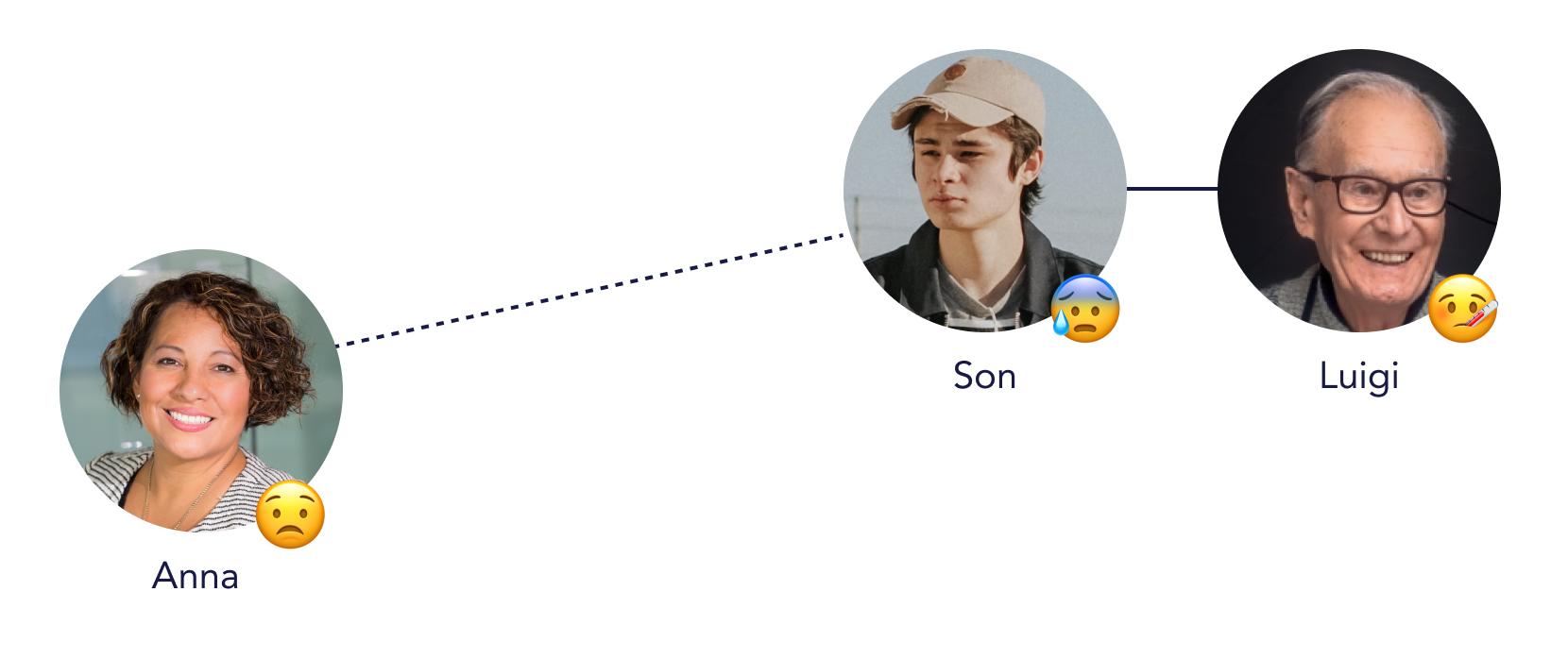
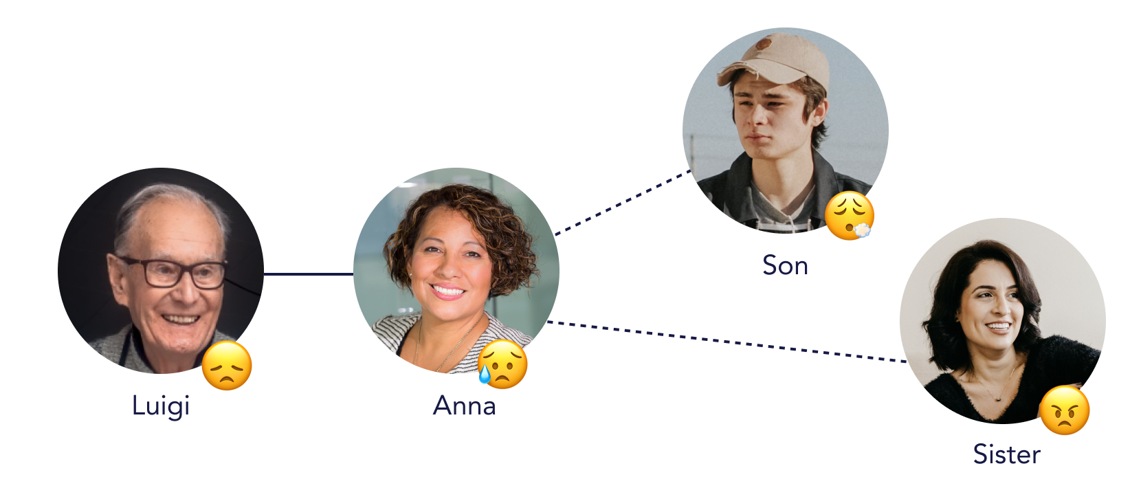
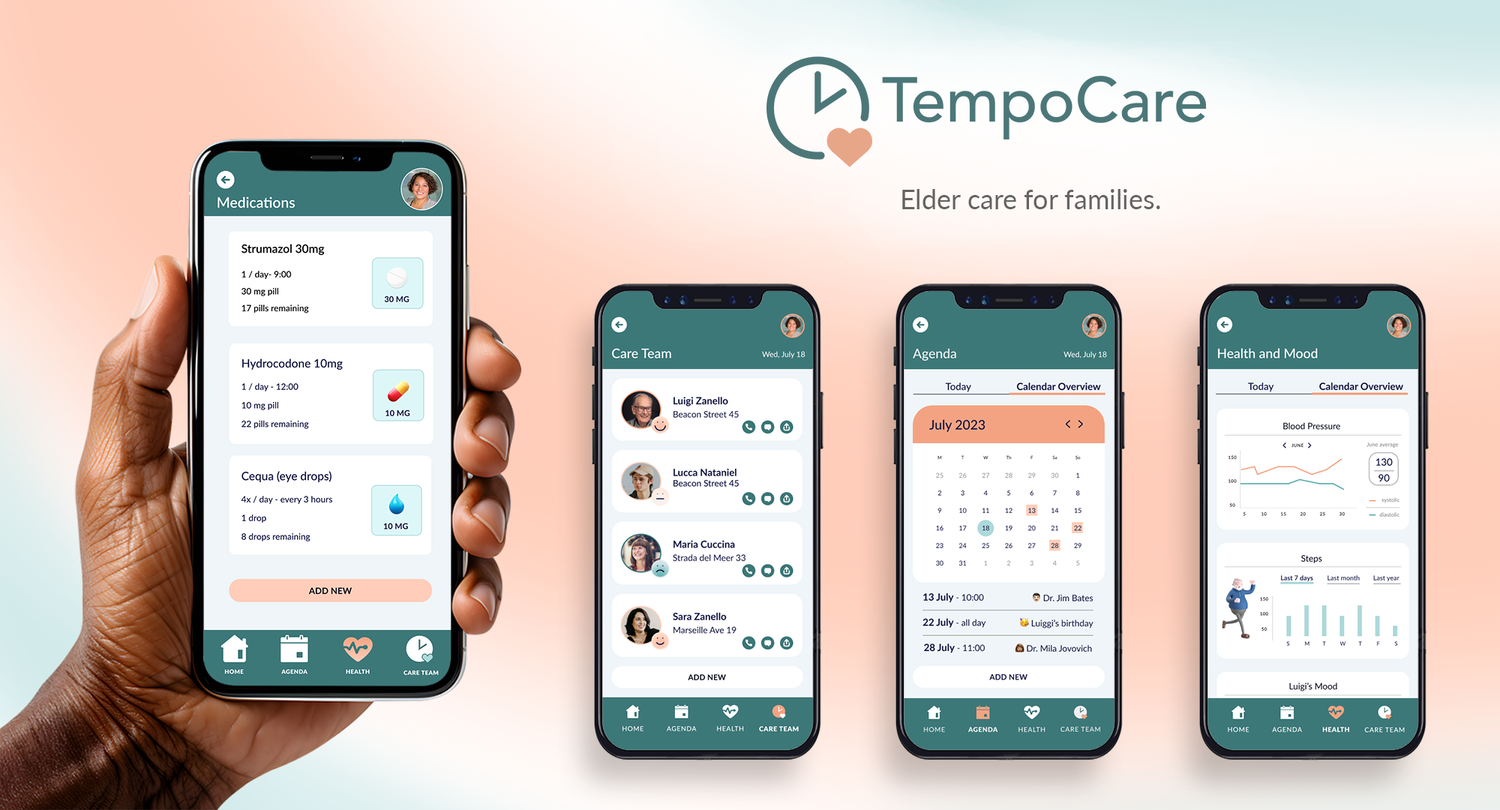
Problem
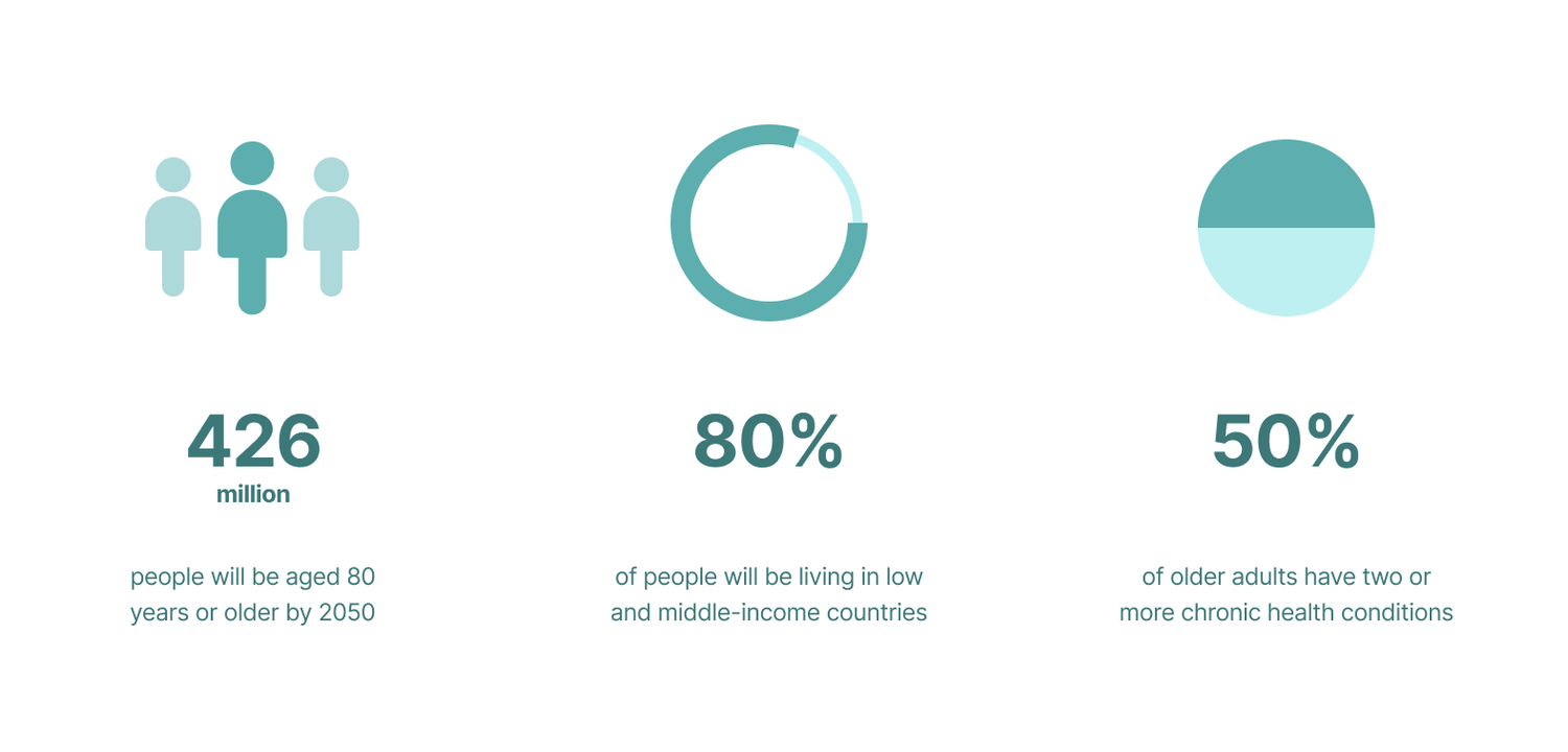
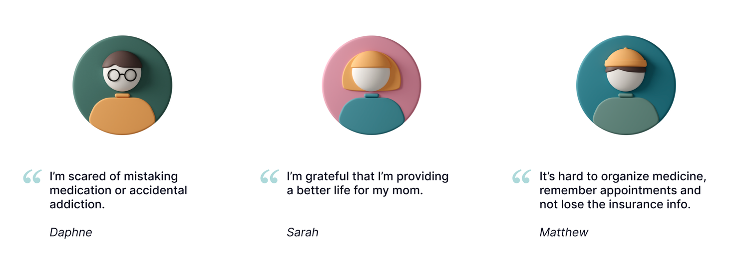
Many elderly and handicapped people rely on friends and family for care. Community-based care is becoming more common with aging populations and rising health care costs. But relying on friends and family puts stress on both parties, and often times tasks fall through gaps in communication, causing emotional tension and possibly affecting the health of the party requiring care.
Goal
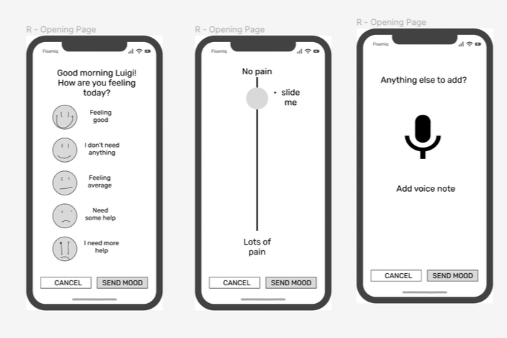
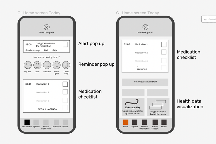
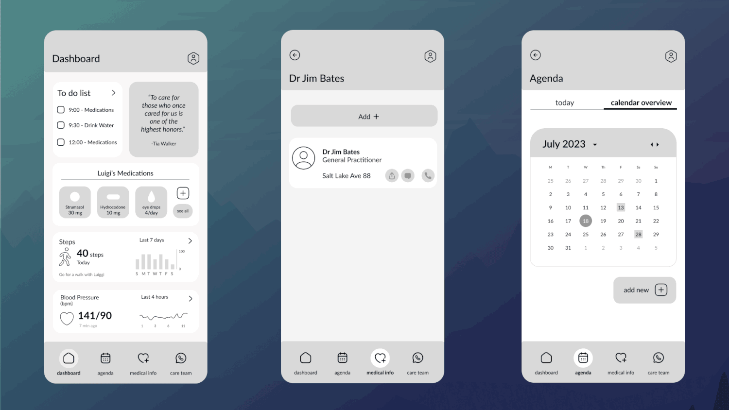
To help both sides of the Care equation more easily communicate the complex time tables and overlapping tasks associated with home care.
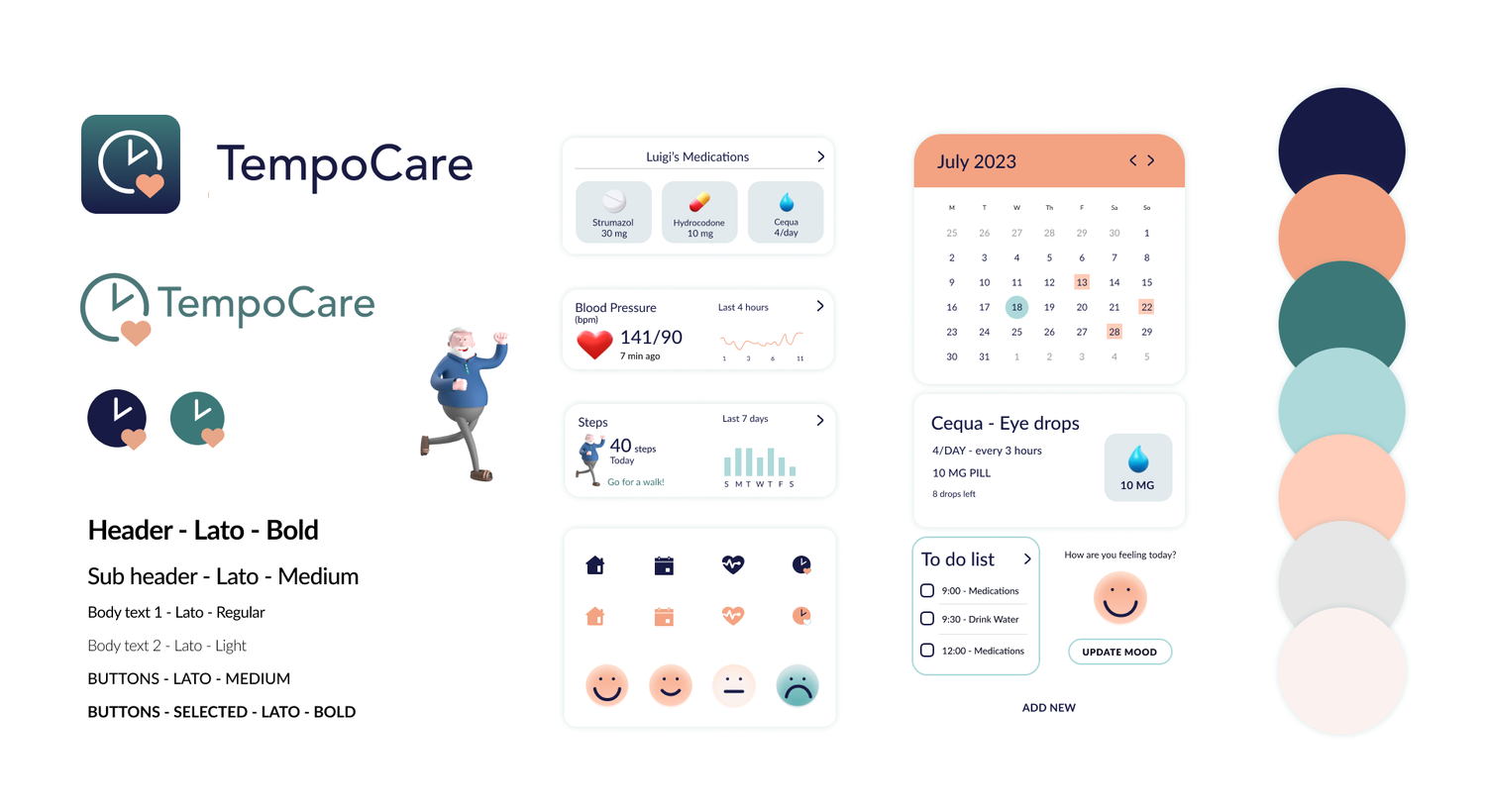
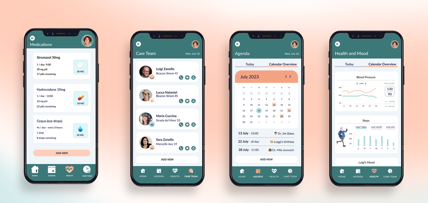
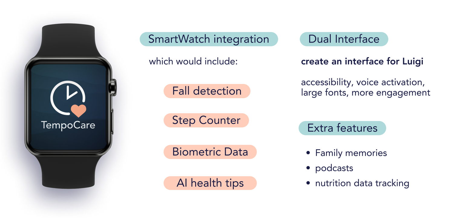
Solution
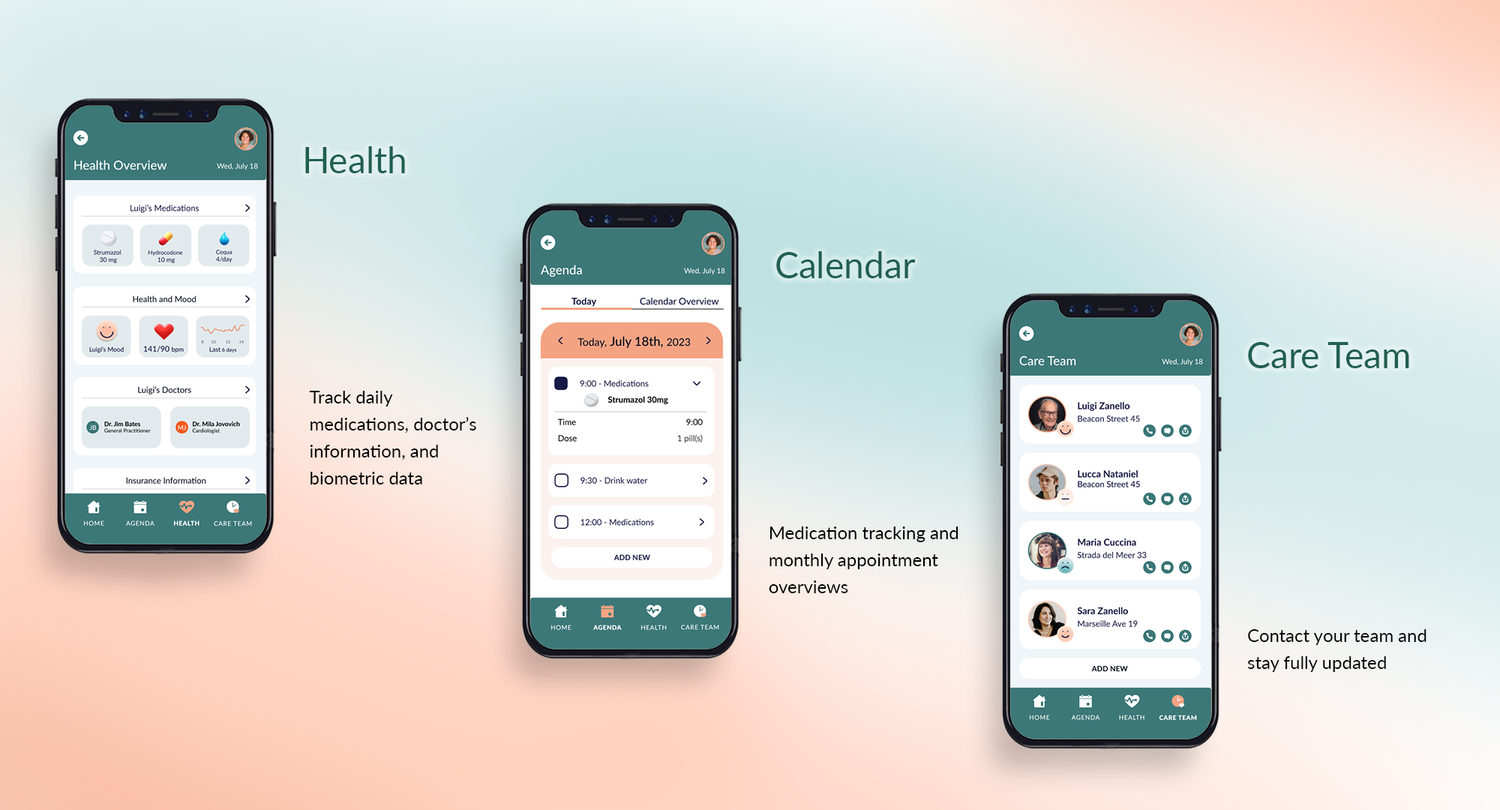
We developed an app that tracks variables in the Home care equation to prevent forgotten tasks, duplicate work, and to reduce stress.

.png?hash=3fbf3fbc6b19ba1dff2060cf1093685bc0ecbe8b&shop=leigh-german-testshop&width={width}&height=2560)