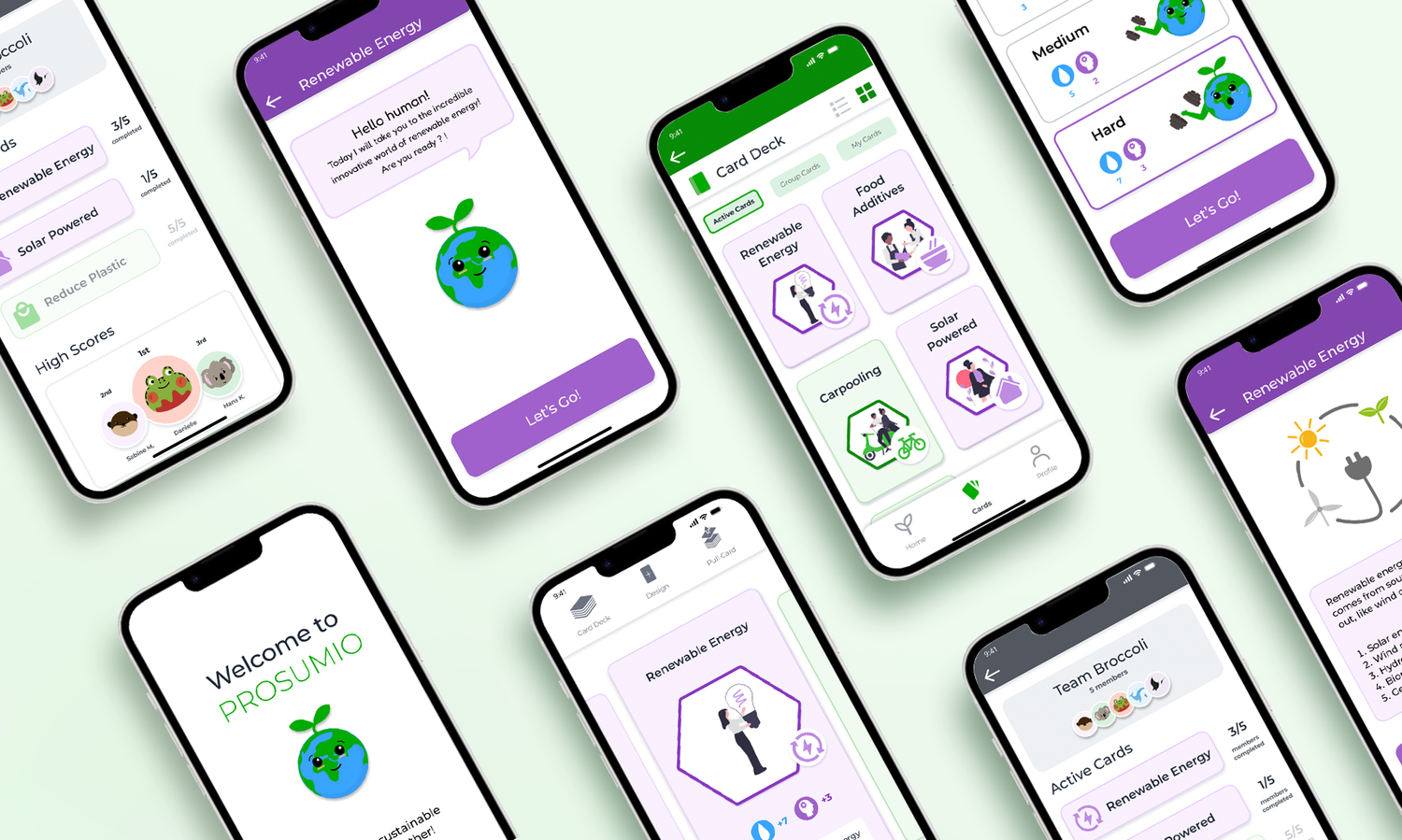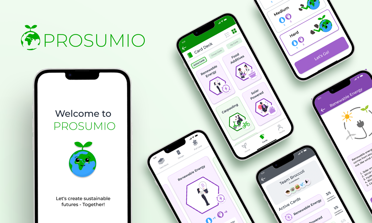
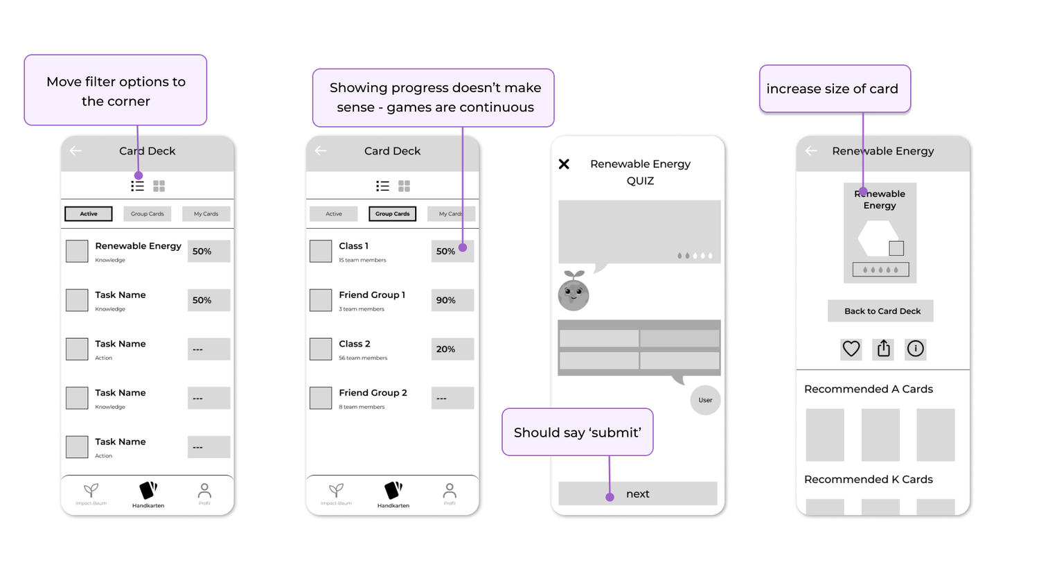
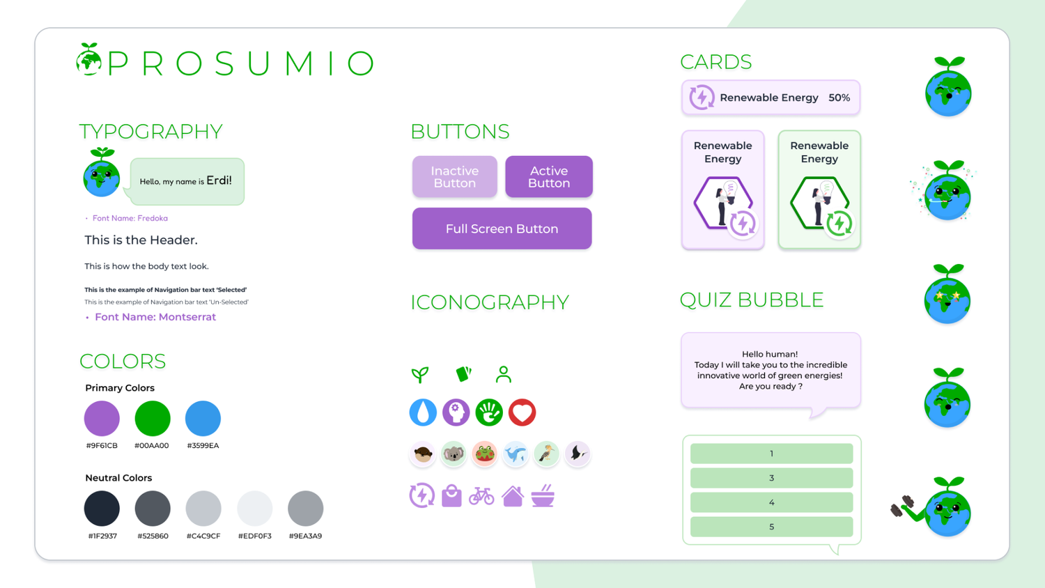
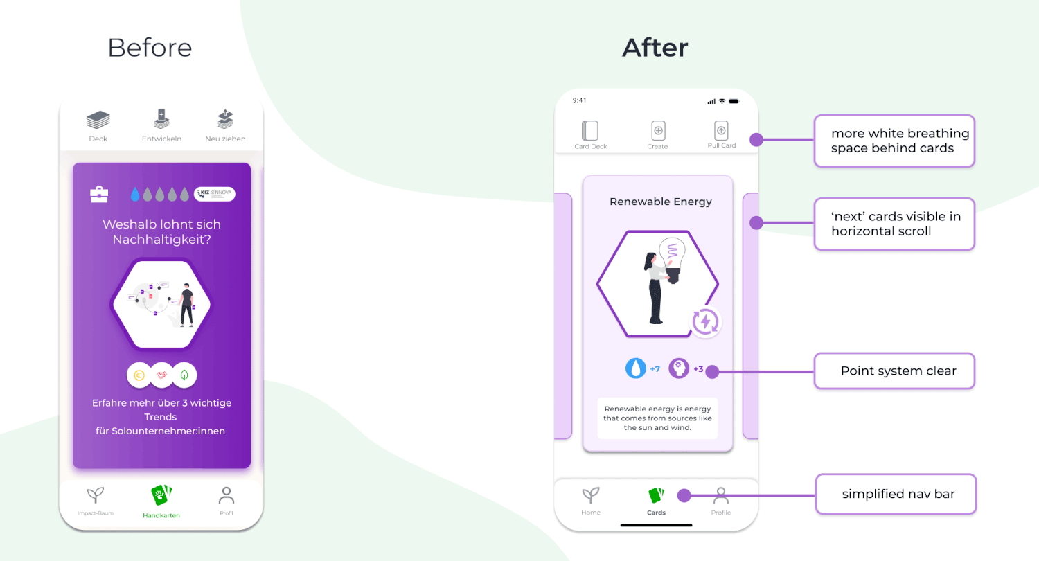
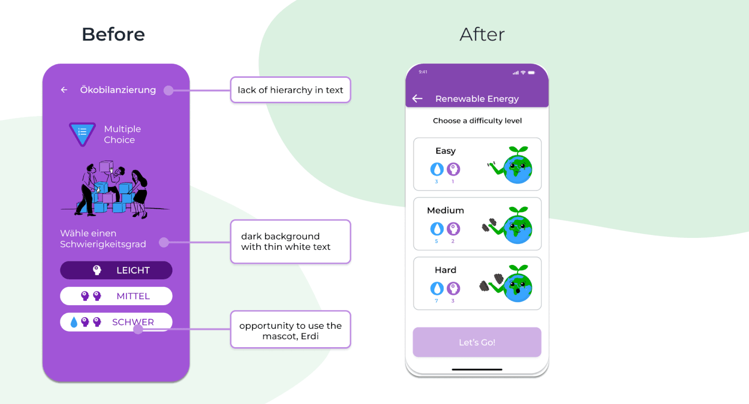
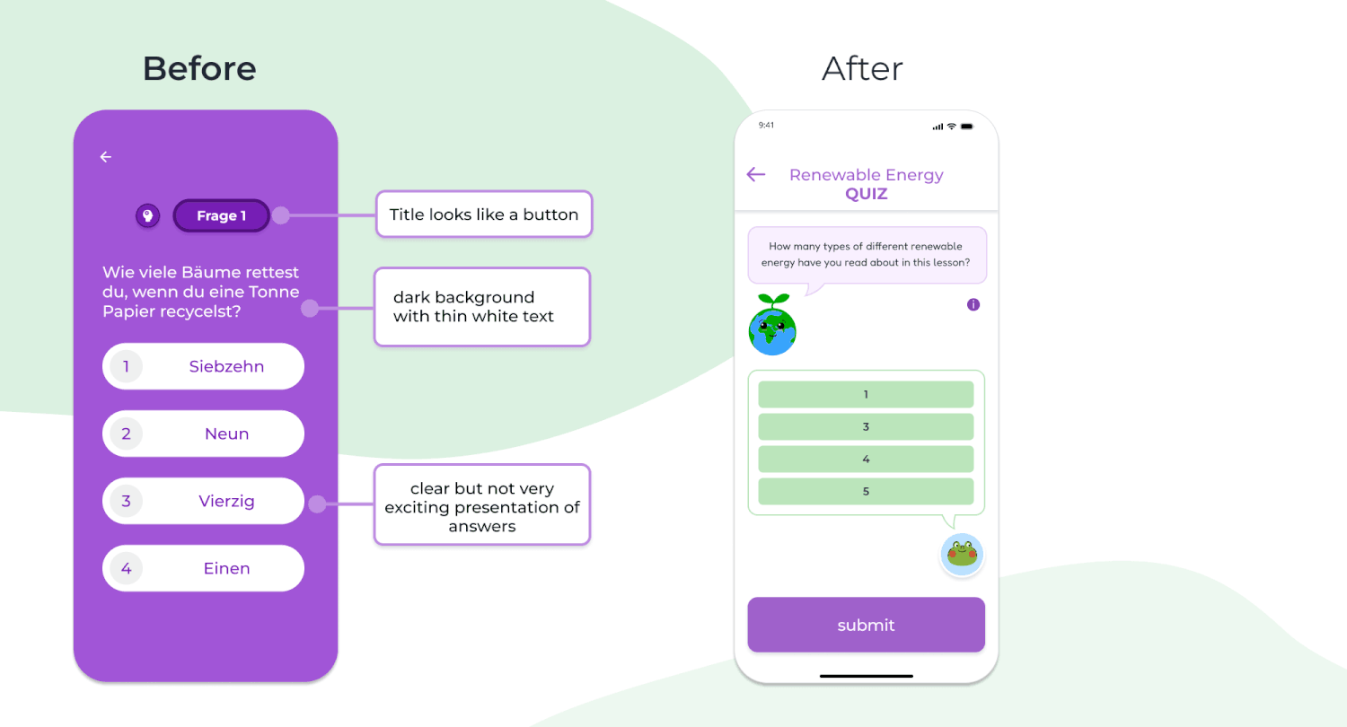
Prosumio - Educational Game App Design
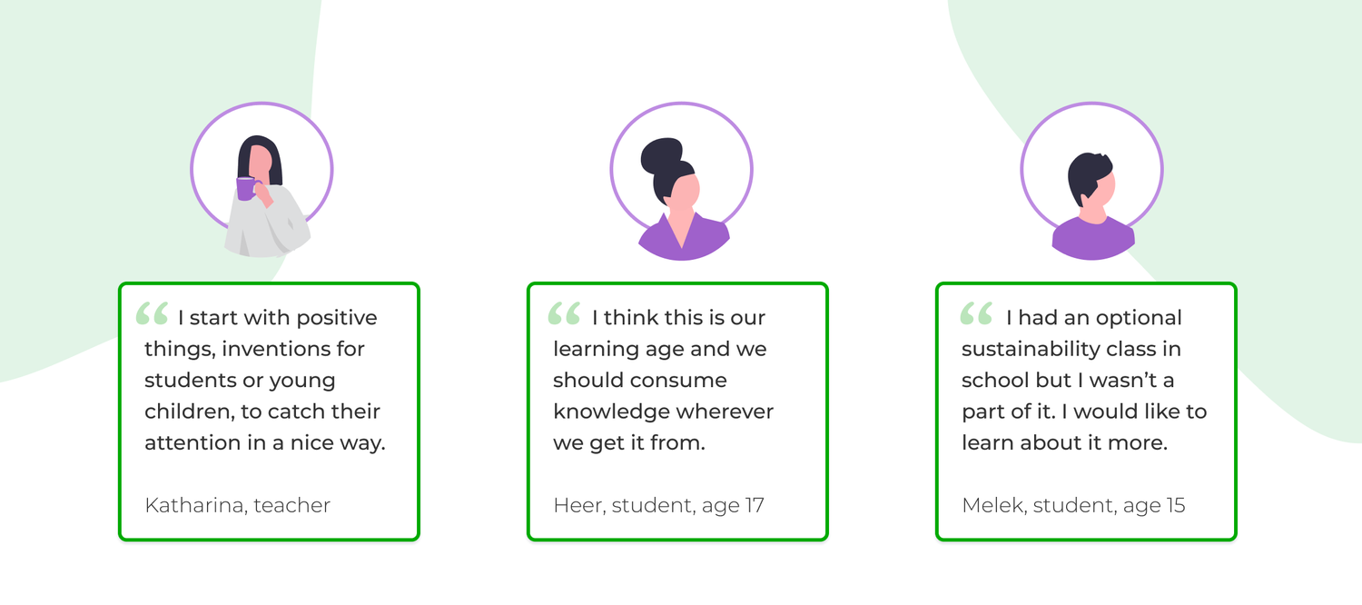
In 2023 I worked with Prosumio, an environmental education start-up based out of Berlin as part of a UX Bootcamp. Prosumio aims to teach teenagers about environmental activism and sustainable behaviours.
Project type
UX, UI, Game design, AB testing
Role
UX/UI Designer
Tools
Figma / FigJam
Illustrator / Photoshop
Duration
2 weeks
.png?hash=af9a5c90e2fe0a8b1c6f3feda48832bc160cc7b0&shop=leigh-german-testshop&width={width}&height=2560)