.png?hash=b05ea3bcedf21e1121079db68cb90cd756ace704&shop=leigh-german-testshop&width={width}&height=2560)
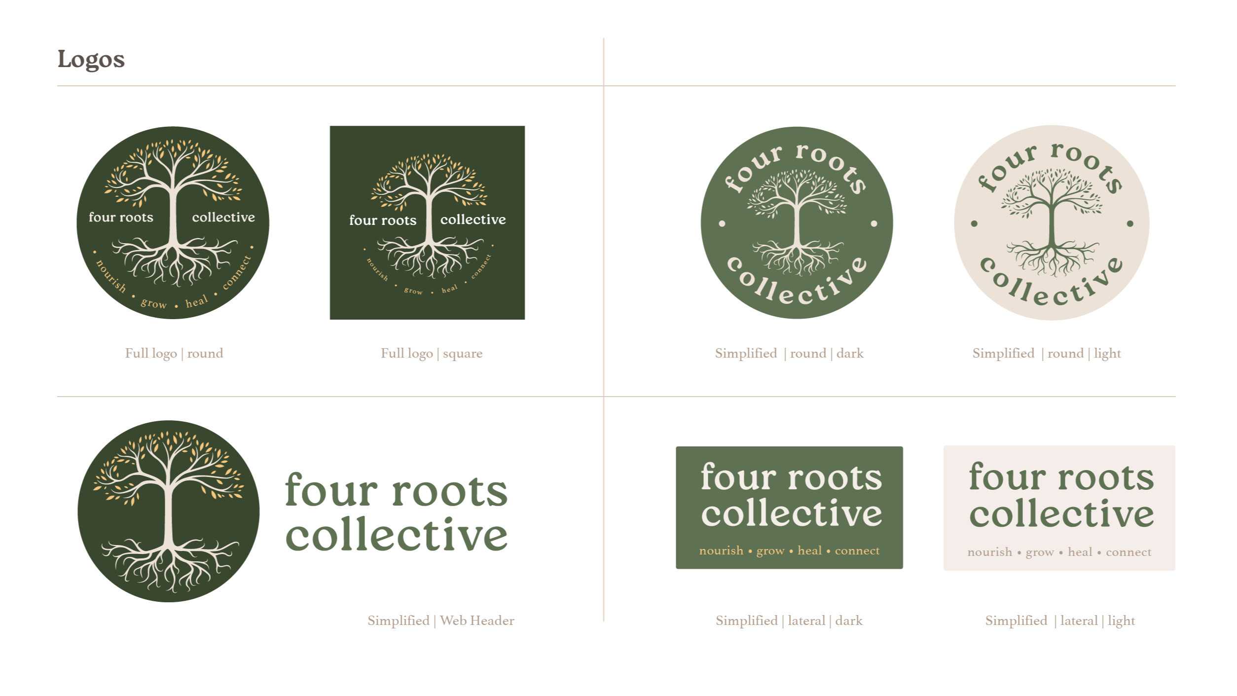
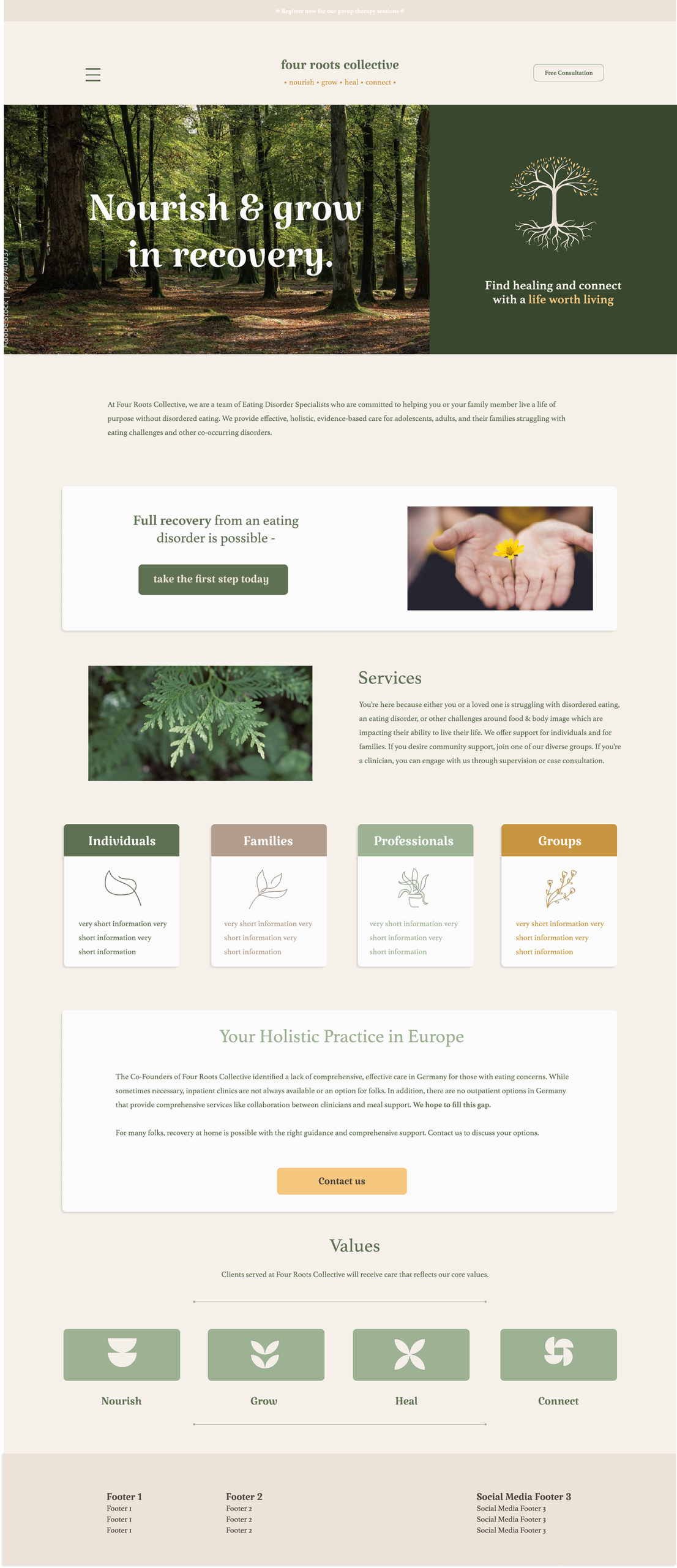
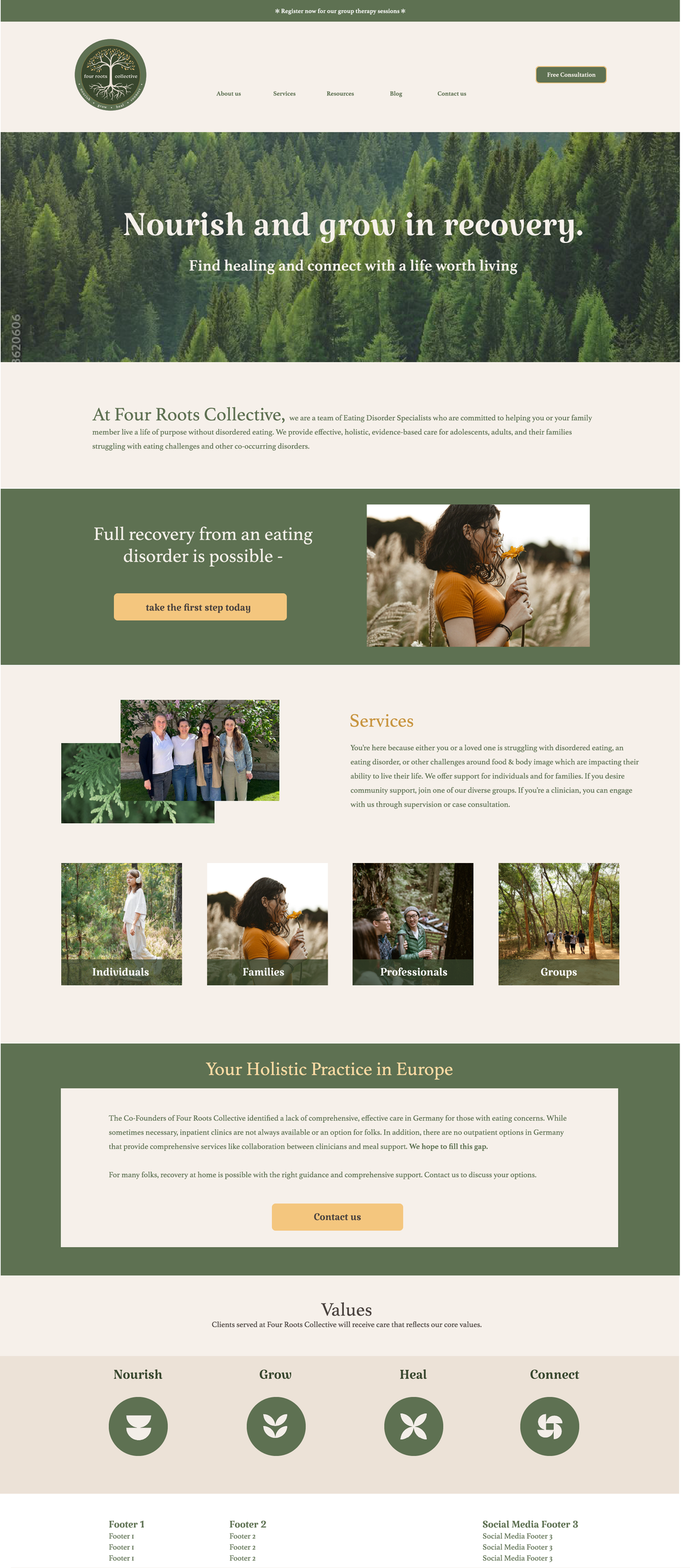
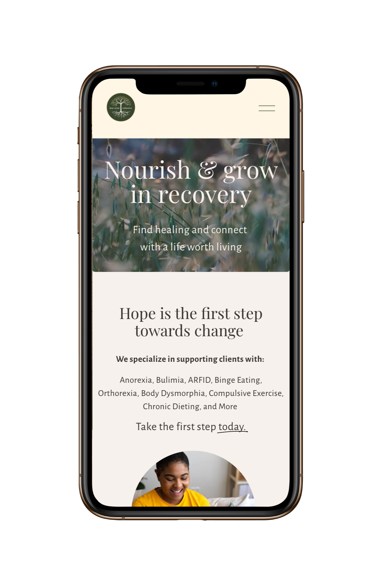
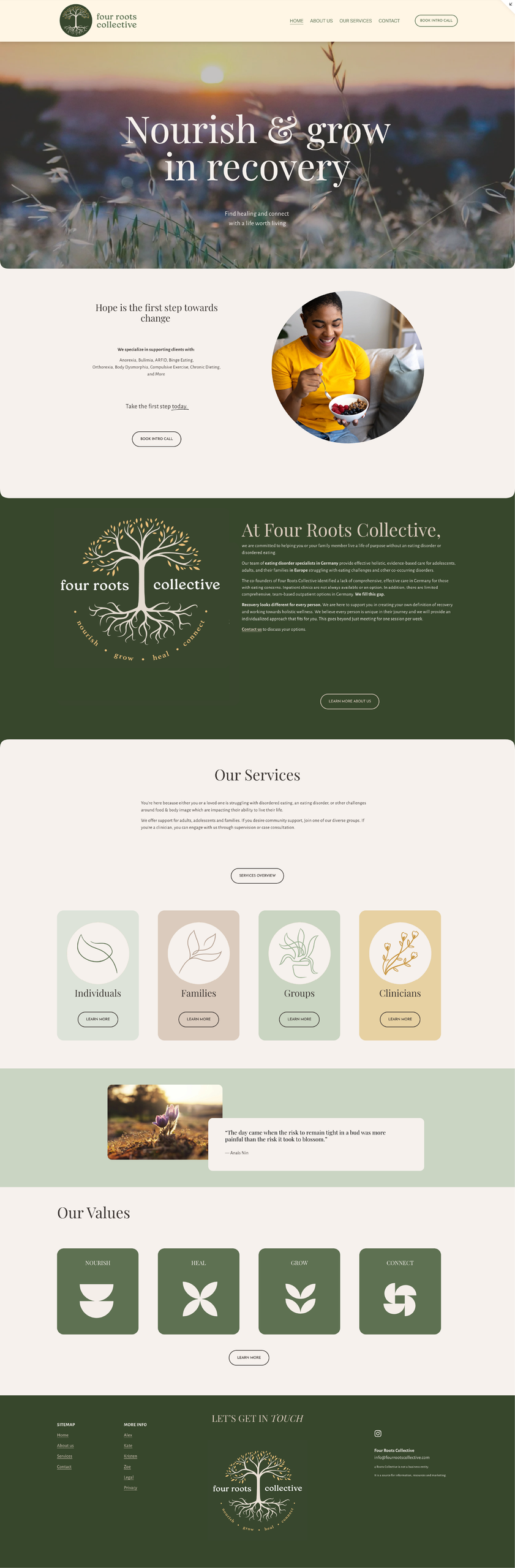
Four Roots Collective Branding & Website Design
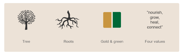
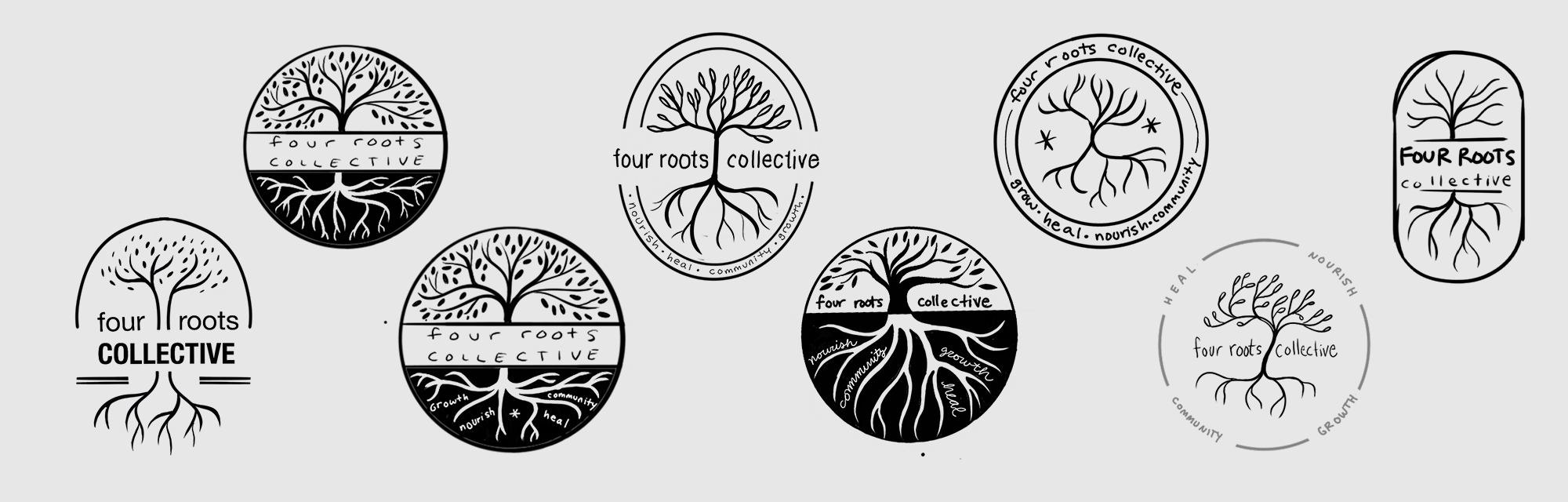
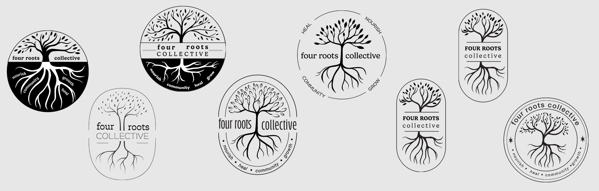
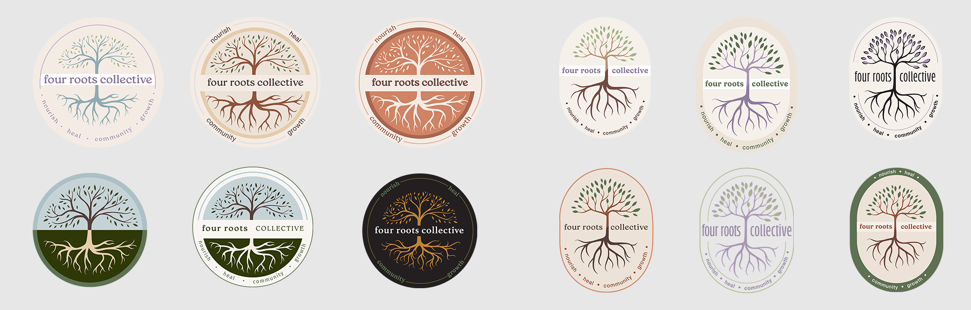
In 2024 I was asked by a dietician friend to create a branding for her new company. She was building an English speaking therapist group specialising in eating disorder recovery. The idea is that their marketing and visibility as freelancers would increase if they joined forces.
I see branding as a tool to communicate the values and intent of an organisation to a specific audience. Therefore, if I did a good job, my work would help people in-need connect with eating disorder recovery resources- very cool!