Legacy Shop Redesign
Working with a client to update their 15 year old website with new branding and design.

Working with a client to update their 15 year old website with new branding and design.
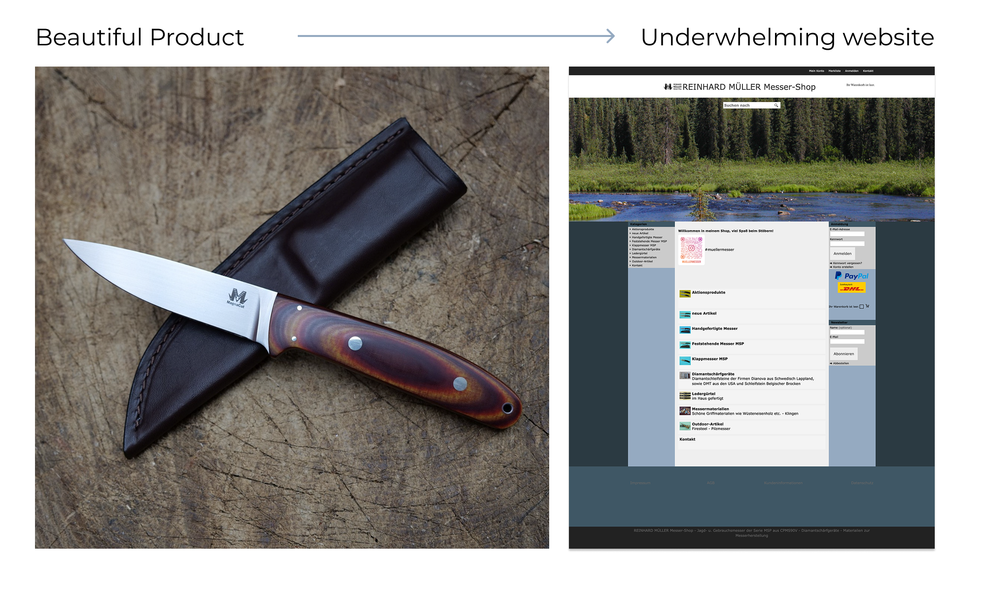
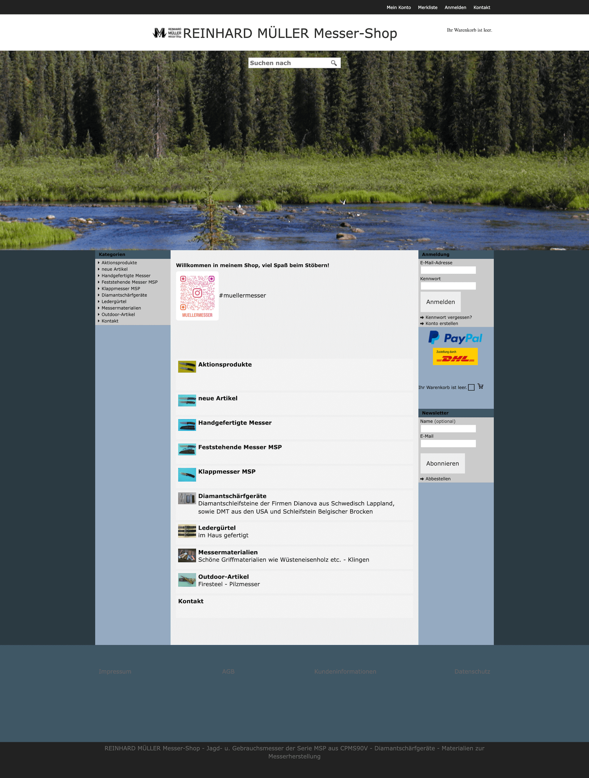
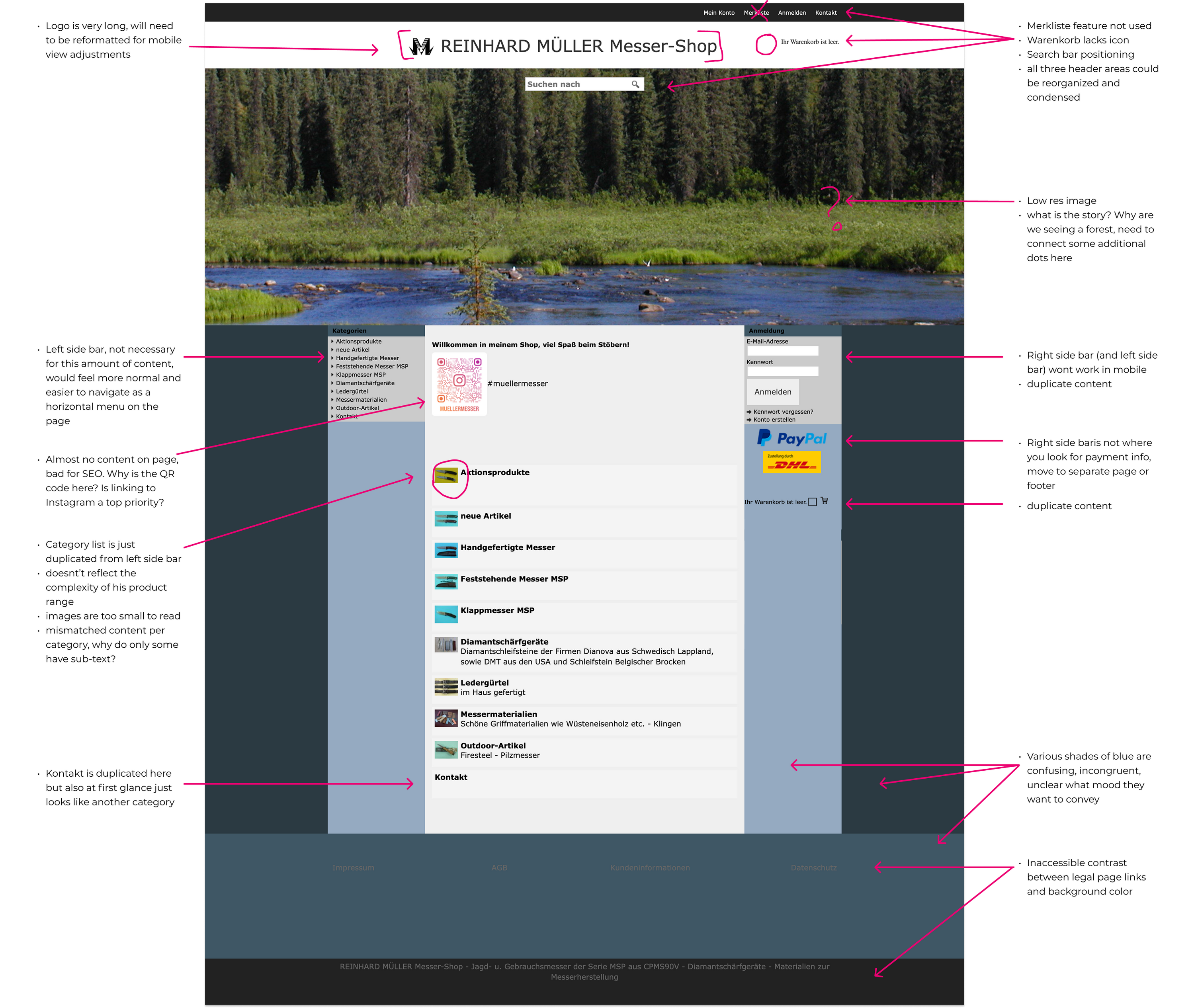
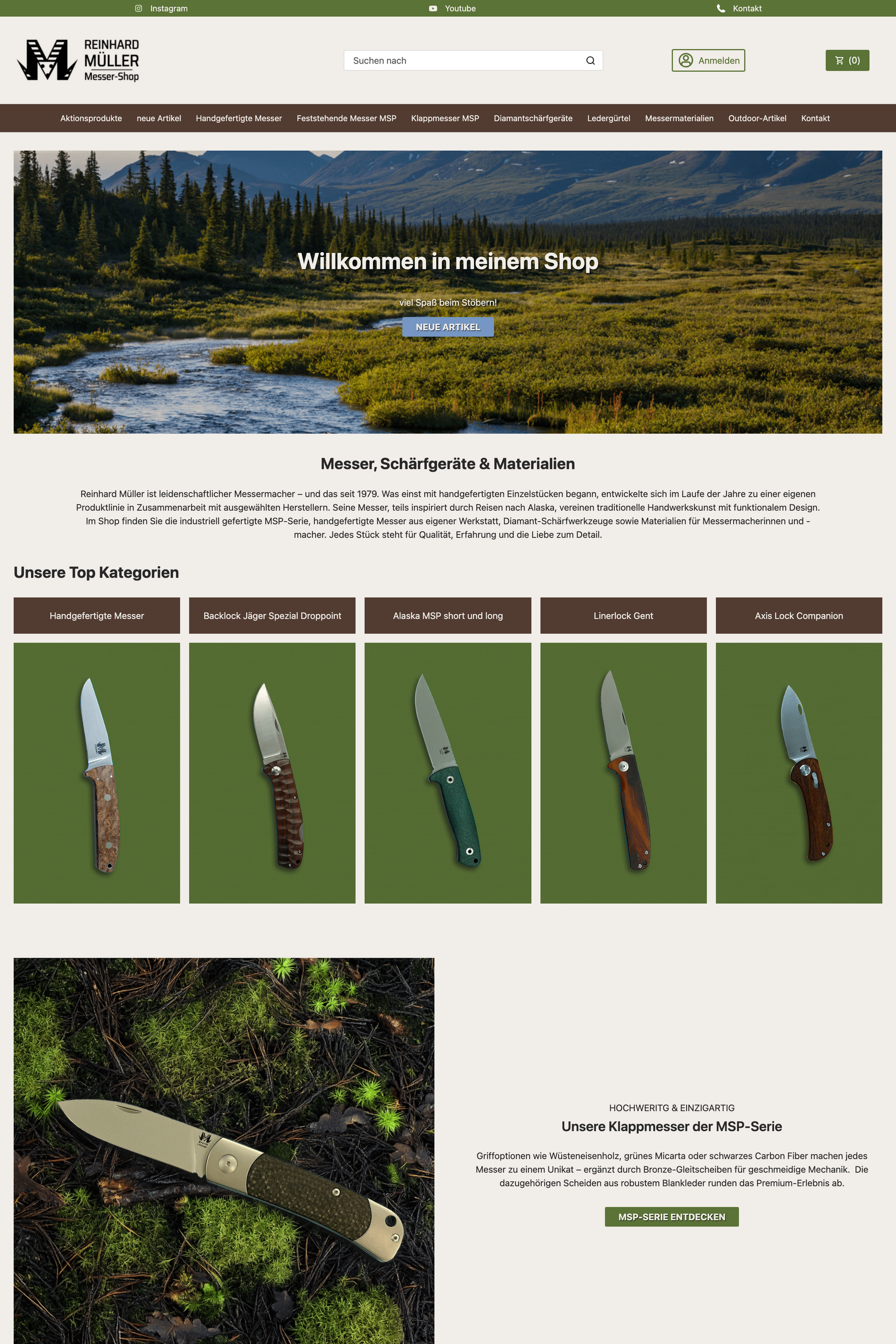
I worked with Mr Müller of Mueller Messer Shop to revamp his ecommerce shop where he sells hunting knives. He hadn't done much work on his site for the past 10 years, and I was particularly stuck by the contrast between the high quality of his product and the total lack of visual appeal to his website. I was excited to get started working on a new design for him to help convert new customers.
I start design projects by following up an initial form with a direct phone or video call. In this case I met with Mr Müller over video call, and we discussed a range of topics. From understanding his product range, to target audience and social media usage, I typically have a lot of questions to help me get a better sense of a business from all angles. Mr Müller has been operating his online shop for almost 20 years so his business model and product range has evolved over time. Since this is a design project not a UX project, I typically have to make guesses about how customers use websites, inferring some things from what the owner says, and some things from common sense and best practices.
Main points that I wanted to improve with his website redesign:
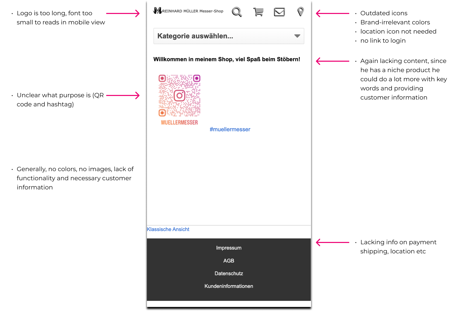
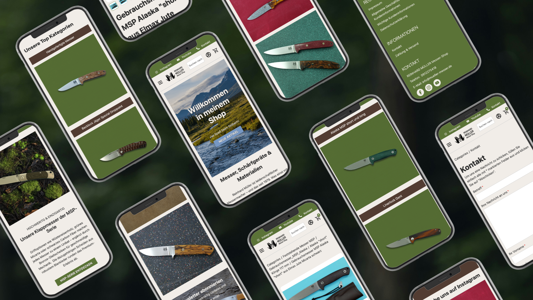
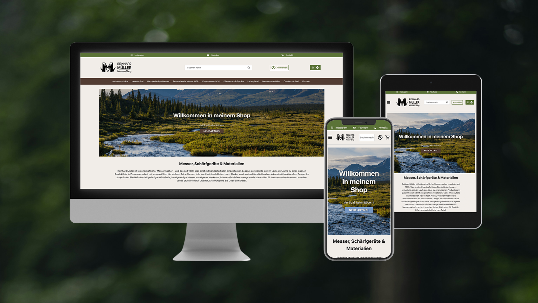
Of course, in general the work I do includes basic improvements such as a fully responsive website and mobile-first coding, but in this case the customer had additional specific wishes.
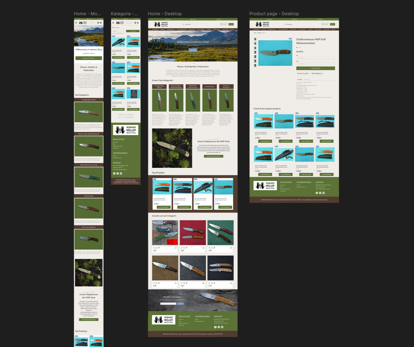
I do iterative drafts in Figma using components that line up pretty well with the code snippets that I use to modify the (very antiquated) platform the shop is built in.
Here we can universally test fonts, colours, and easily create corresponding desktop and mobile views.
In this case, after a few corrections to category prioritisation, we only made small changes to text and content.
There were a few interesting aspects to the work I did for this shop that I'll try to quickly summarise below.
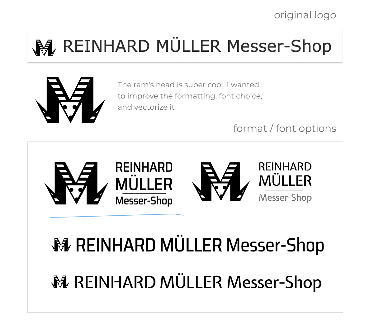
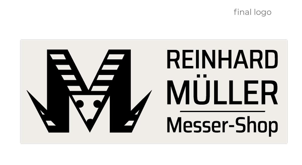
Logo
Mr Müller's logo was not formatted correctly for the site and needed to be properly vectorised. I love working with logos so quickly provided him with a mini design iteration to update the quality of his design.
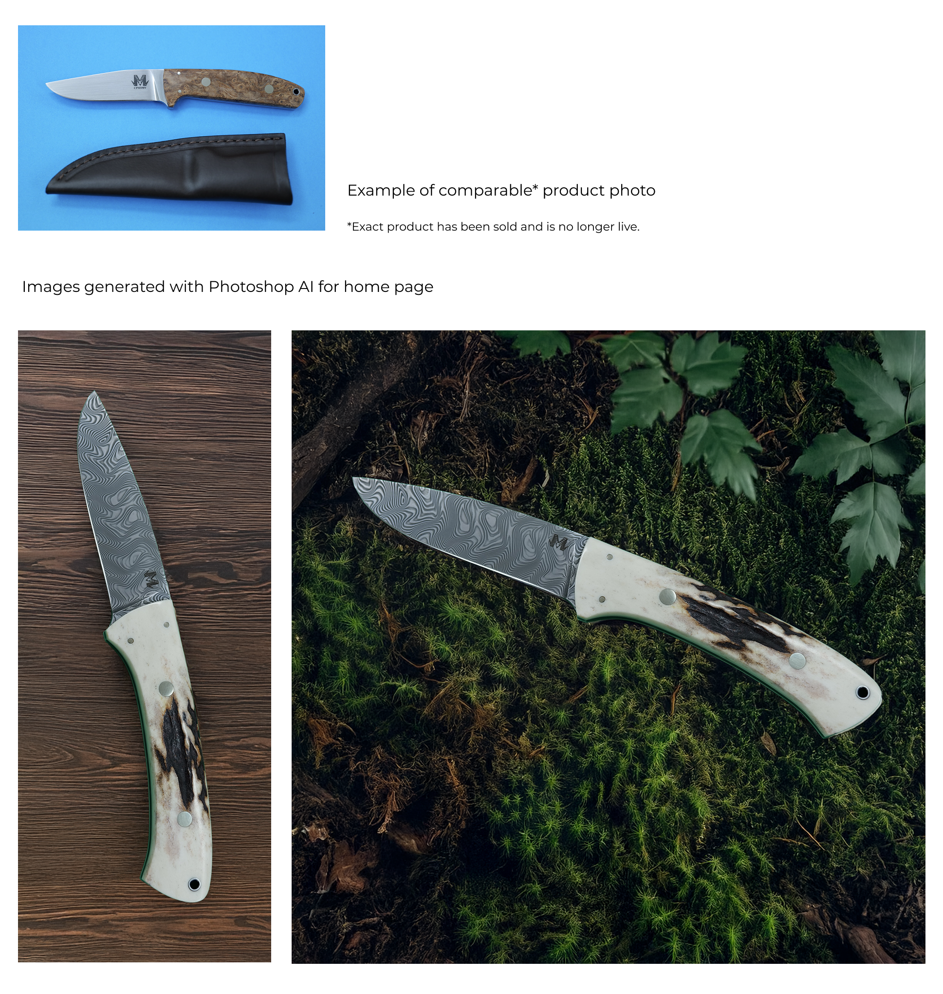
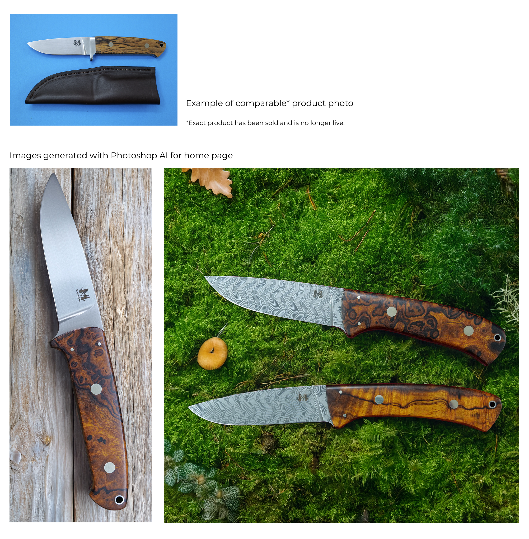
AI image generation
As mentioned before, Mr Müller's products are beautiful but most of the photography on his website was unsuited for any large scale display on a home page. Using his existing product photos, I created a series of AI images to help tell a story with his products. My hope was that by showing the knives in context it would accentuate their use of natural materials and tell a more compelling story.
Instagram Connection (free)
The Instagram for the shop has a lot of quality content that I thought would add dimension to the existing site. There are a lot of paid apps that can be used to integrate latest Instagram posts to a website, and there was previously a free iframe option to use, but I decided to imitate these with a free version that the client could easily update himself just by uploading new photos and relinking them.
SEO improvements
Mr Müller wanted to improve his SEO and I had a few ideas for things that could easily be implemented in his shop.
In general I am satisfied with how it turned out but I learned a few things from working on this design.
Don't always be too literal
In this case, the customer requested I use brown, blue and green in the page. I did this. It looks weird! Why did he request such a weird colour combination? I think, in retrospect, that he was trying to use colours to describe his desired vibe, aka woodsy, outdoorsy.
Push your ideas in a positive way
I didn't want to alter his preexisting category names, even though some of them are objectively too long. I think at the end of the day his customers are largely returning customers